
The Perennial Question
Clients often ask us: what is the one metric to best characterize the true state of user sentiment?
Of course, much of this search for “the one” is driven by a desire for brevity. These days, it seems everyone wants information distilled down to a single perfect number or soundbite. Regardless, the question remains valid. A single metric is easy to grasp and communicate.
Well, it turns out we’re in luck — there are actually two great candidates!
So, let’s discuss each in turn, and then suggest a few of our own.
Candidate #1: Net Promoter Score
When organizations look for the proverbial “one and only” metric, NPS is almost invariably the go-to number. It’s extremely well known, it’s even a registered trademark (originated by Bain & Company). And being so well established, it’s typically executed consistently across organizations in order to maintain compliance with the trademark.
Basically, it goes like this:
We present respondents with a single question: “How likely are you to recommend company | brand | product | service to a friend or colleague?”
- We provide an answer scale that’s specified in a range from 0 to 10 (i.e. 11 numbers in total), with 0 being “not likely at all”, 10 being “extremely likely”, and 5 being right in the middle
- We tally the responses into 3 buckets, each expressed as a percent of the total: promoters (responses 9 – 10), passives (responses 7 – 8), and detractors (responses 0 – 6)
- Finally, we calculate the Net Promoter Score as a single number: % promoters – % detractors
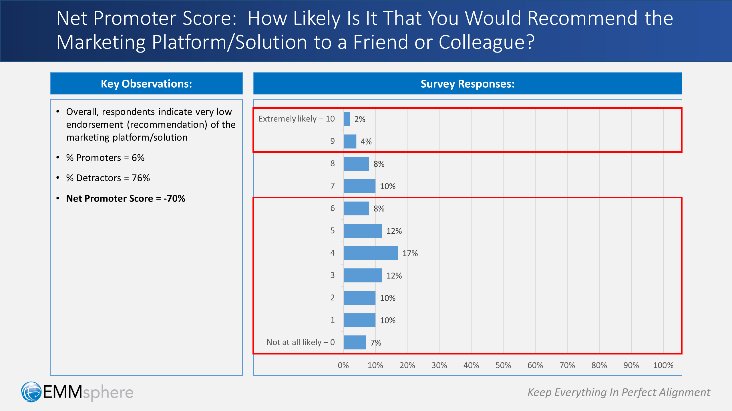
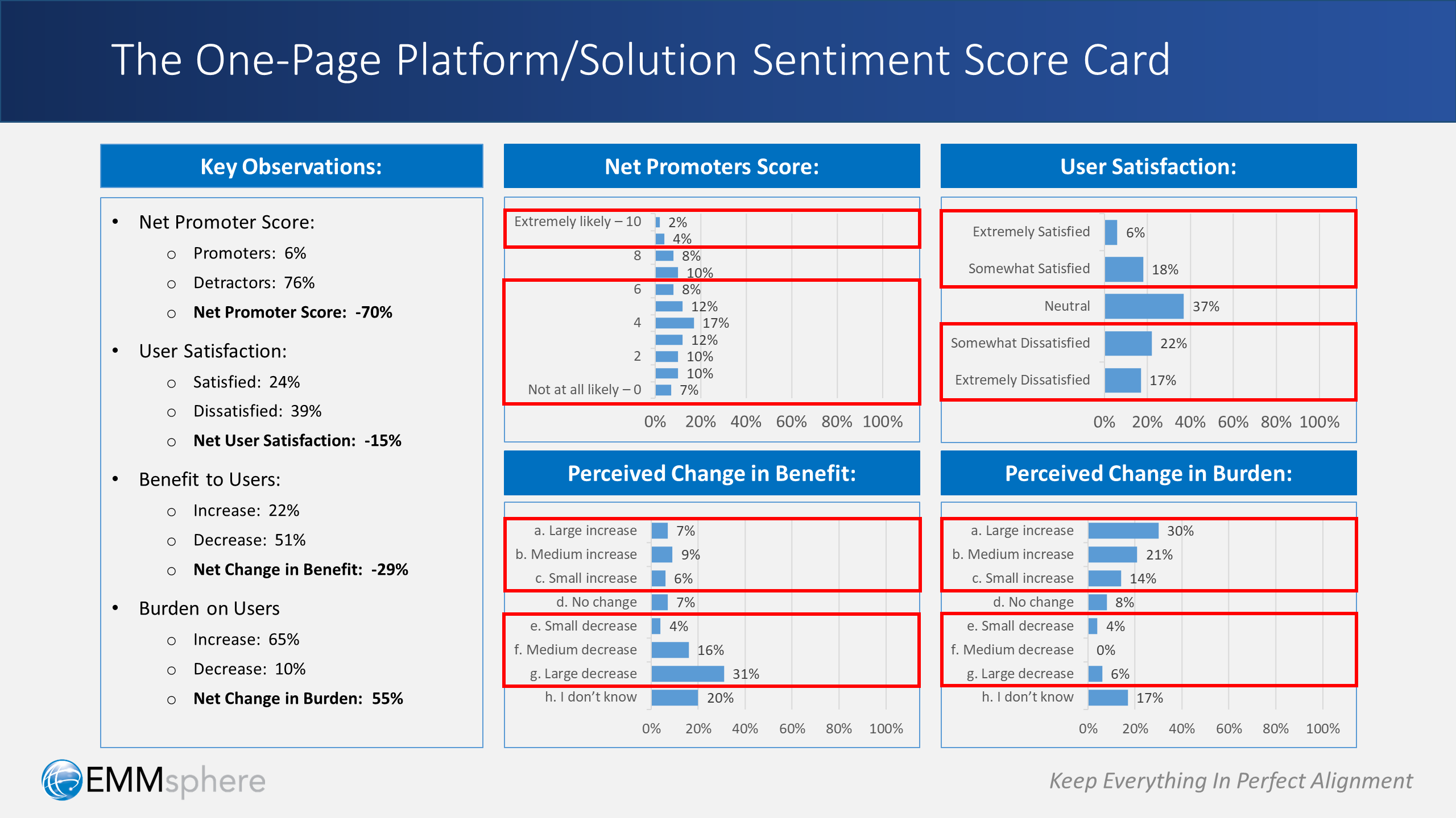
To illustrate the methodology, take a look at the example above. In this case, we have a situation with an alarmingly low NPS number, calculated as follows:
- Promoters = 6%
- Detractors = 76%
- Net Promoter Score = -70%
Tight, tidy and to the point, right? We certainly think so — we use NPS all the time.
But, we also think there are a few things to keep in mind:
- NPS is typically used to understand the likelihood that respondents will recommend, advocate, or vouch for a particular company or brand. That is not necessarily synonymous with their satisfaction with the company’s product or service. While correlated, satisfaction does not automatically imply active recommendation — which is why NPS considers only the top two responses (9 & 10) as promoters (i.e. many may like, but fewer will actively recommend)
- NPS is typically considered more of a long-term metric to gauge loyalty to a company or brand, as opposed to an immediate pulse check to capture current sentiment or satisfaction
- NPS is calculated in a way that’s skewed toward the top of the scale (i.e. 2 responses for promoters vs. 7 responses for detractors). This is because it’s intended to predict an active behavior (i.e. likelihood to actively promote or lobby on behalf of the company or brand), as opposed to just “thinking nice thoughts” about the company or brand
Candidate #2: User/Customer Satisfaction
The other metric often used as the “one and only” is the standard user/customer satisfaction measurement.
There are many ways of phrasing the question, but it’s typically something along the lines of: “How satisfied are you with the company | product | service | solution?”
- The response scale is usually specified with 3, 5 or 7 options ranging from “extremely satisfied” to “extremely dissatisfied”, with consistent gradations or levels of satisfaction between the two extreme options
- The response scale is typically specified in a symmetrical manner, with the same number of positive gradations as negative gradations, and a neutral level in the middle
- Satisfaction is often summarized as a “total satisfaction” percentage (e.g. the total across the positive levels), or as a “net satisfaction” percentage (the total of the positive levels minus the total of the negative levels)
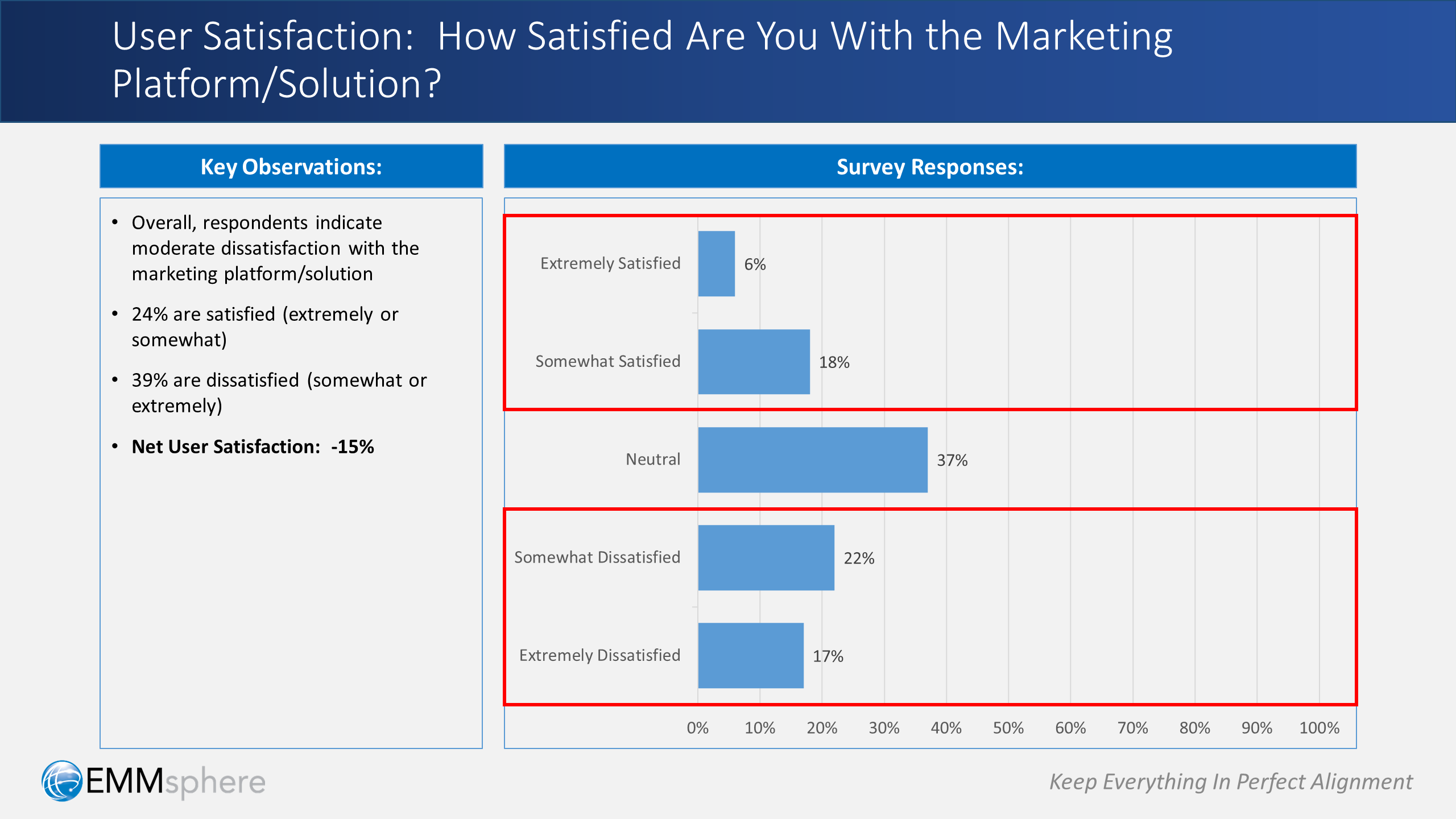
To illustrate the this approach, consider example above. In this case, we have a situation with a moderately low satisfaction number, calculated as follows:
- Satisfied (extremely or somewhat) = 24%
- Dissatisfied (extremely or somewhat) = 39%
- Net Satisfaction = -15%
Looks meaningful and familiar, right? We definitely think so — and so does nearly everyone else!
User/customer satisfaction measurements are foundational metrics used by virtually all organizations that have an interest in understanding sentiment with respect to a product, service or solution.
In our case, we always use it to measure satisfaction with respect to an organization’s marketing technology platform and/or configured solution.
A couple of things to keep in mind, however:
- Satisfaction measurements provide a valuable indicator of current sentiment or state of mind, but unlike the NPS, they are not intended to be predictors of action or behavior
- Satisfaction measurements do not give indication as to the underlying cause of the positive or negative satisfaction
- Satisfaction measurements can sometimes indicate a level of urgency for investigating deeper to uncover the key drivers of satisfaction (e.g. to capitalize further) or dissatisfaction (e.g. to stem the hemorrhaging)
Net Promoter Score vs. User/Customer Satisfaction
So, do we think you should use Net Promoter Score or User/Customer Satisfaction as the one and only measurement? Well, the answer is “yes”.
We mean that literally: use them both! The reality is that each offers a distinct perspective, both of which are extremely valuable.
And, the reality is also that within your organization, you’ll likely have die-hard supporters of one metric and also of the other. It’s a valid and ongoing debate, and not one that’s easily resolved. In the end, each camp will want it’s favorite metric.
So go the extra mile: do both metrics — deliver on the interests of both camps. The incremental effort is minimal, and that way everyone will be satisfied.
But: don’t mix and match!
If you use the Net Promoter Score, adhere to the letter of it’s registered methodology. That’s what people are familiar with and that’s what they’ll expect.
Alternately, if you use User/Customer Satisfaction, do it on it’s own, with no comingling of Net Promoter Score concepts.
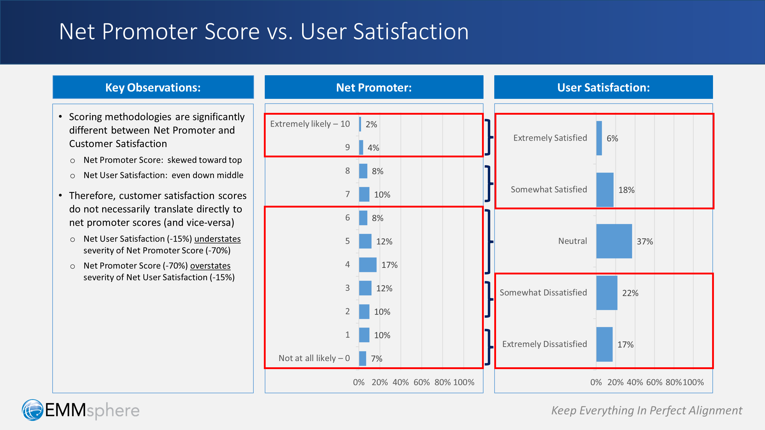
The reason is this: scoring methodologies are fundamentally different between the Net Promoter Score and the User/Customer Satisfaction. In essence:
- Net Promoter Score is by definition a skewed calculation: it takes the top 2 levels together and subtracts the bottom 7 levels
- User/Customer Satisfaction is by definition is symmetrical calculation: it takes the “above the middle” levels together and subtracts out the “below the middle” levels
To illustrate the point, take a look at the side-by-side comparison above and consider what happens if we mix and match:
- If we position our Net User Satisfaction (-15%) as the Net Promoter Score, it will significantly understate the severity of the actual Net Promoter Score (-70%)
- If we position our Net Promoter Score (-70%) as the User/Customer Satisfaction, it will significantly overstate the severity of the actual Net User Satisfaction (-15%)
In other words:
- In the 1st case, we’ll miss sounding the alarm bell (when we should be banging on it loudly)
- In the 2nd case, we’ll inadvertently bang on the alarm bell (when a mild warning may be warranted instead)
Two Other Candidates to Consider
We’ve covered the two most well-known metrics around sentiment, but are there others? Yes, and there are also various permutations of the traditional User/Customer Satisfaction we’ve discussed here.
But, there’s one key thing that all of these candidates don’t cover, which comes down to a single word: causality.
Of course, causality is a broad topic that merits its own discussion and analysis.
However, we believe there are two simple questions that can go a long way to begin explaining why the Net Promoter Score or the User/Customer Satisfaction is at any particular value:
- Question 1: “Do you believe that the marketing platform/solution is helpful and/or beneficial to you (compared to a prior platform/solution)”?
- Question 2: “Do you believe that the marketing platform/solution imposes additional burden on you (compared to a prior platform/solution)”?
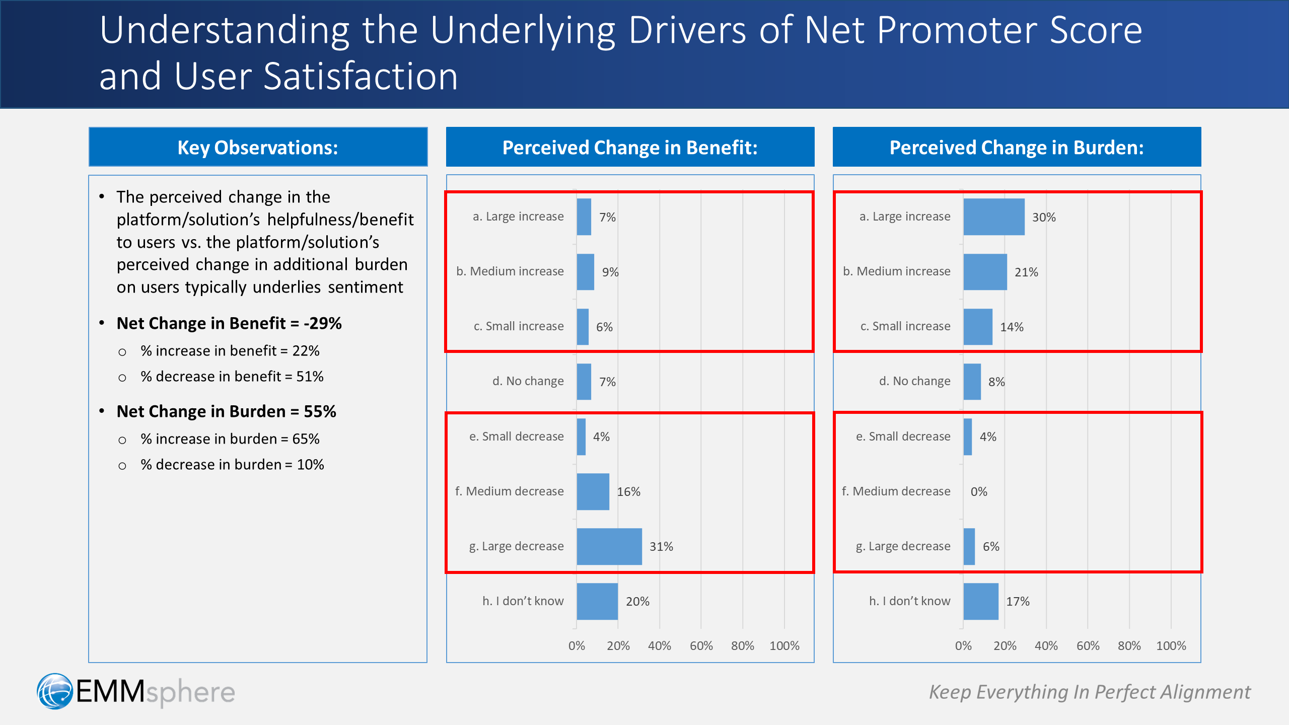
We call this the “benefit vs. burden” analysis, which is illustrated above.
Taken together, these questions often provide compelling insights that go to the very heart of causality — which in turn drives sentiment. For example, in the illustration above:
- The perceived change in the platform/solution’s net benefit offered to users: –29% (i.e. 22% total increase in benefit vs. 51% total decrease)
- The perceived change in the platform/solution’s net burden imposed on users: 55% (i.e. 65% total increase in burden vs. 10% total decrease)
When results are as lopsided as these, it should be no surprise why users aren’t happy: it’s simply not working for them!
Netting It All Out: “The One-Pager” instead of “The One Metric”
So, let’s wrap up by coming back around to the initial question: is there one metric to rule them all?
Well, yes and no.
As we’ve discussed, there are several great candidates, and each has it’s time and place — but they’re not 100% substitutes for one another.
That’s why we rarely use only one. Instead, we often use four — and show them on a single page!
Specifically: we show the Net Promoter Score, User Satisfaction, Net Benefit and Net Burden together in a single-page, 4-part score card — we call it “The PSBB Chart” (i.e. promoter, satisfaction, benefit, burden).
The example above illustrates how this might look. This one-page approach has worked remarkably well for our clients, and we hope it works for you too.
In short, our bottom-line advice is this: focus on a handful of key metrics, and include a few steps toward causality. Or in other words:
Leave a Reply